100 Day Project 2017 Artwork Updates

This year of 2018 has brought some changes. I have shifted my art practice from creating Every Day art series to EcoMemory commission art for clients. I also did not participate in the 100 Day challenge after completing the challenge the past three years (and even continuing in between). I miss the past daily rituals in the studio but I love the interaction with my clients, discussing their memories of their favorite places in nature, and creating art to reflect those memories. As I look back at the 100 day projects, I am reminded of the amount of focus and hard work needed to pull it off.

Here is the original article I wrote about 2017’s 100 Day Project.

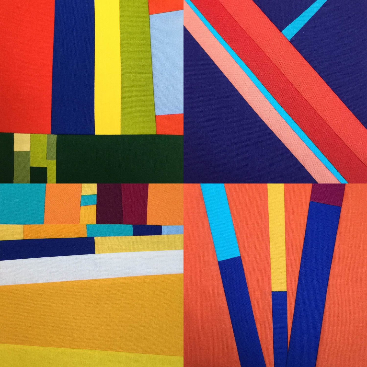
In the past two 100 Day Projects, I have created a four part series around a theme. In 2016, my theme was the Four Elements. I created a 25 day piece sewing together 25 daily squares for each of the elements; Fire, Sky, Water and Earth. This year's theme was Trees and Windows. Since I just finished the 100 Day Project last week, I decided to give some insight into my creative process by sharing, and maybe rambling a bit, about what I was thinking for each piece in this four part series.

Trees and Windows Four Part series for 100 Day Project, April 4-July 12, 2017.  Upper Right: Trees  Upper Left: Windows  Lower Left: Inverse Windows  Lower Right: Inverse Trees

Trees and Windows Four Part series for 100 Day Project, April 4-July 12, 2017.  Upper Right: Trees  Upper Left: Windows  Lower Left: Inverse Windows  Lower Right: Inverse Trees

This year I was inspired by the art of Elizabeth Gourlay. In particular, I was drawn to her geometric art with color strips around the outside of a square and pieces with vertical and horizontal lines made up of small strips of color within the line. I envisioned the vertical strips as trees and the square piece as a window frame. Hence the name of the series is Trees and Windows. I knew I could have these two pieces compliment each other with the design. For the other two pieces in the series, I thought I could just reverse the design concept and call them Inverse Trees and Inverse Windows. Instead of color strips on the edges of a square like a window frame, the second piece would be full of color strips on the inside of the window and then grey as the window frame. For the tree series, the inverse would be a grey vertical strip amongst strips of fabric as the background.

The color palette for the entire series is a play between warm and cool colors. The Trees and Inverse Trees series use cool colors like blue, green and purple in varied color intensities. I added in a very light green color to contrast with the dark grey background. These light green pieces really stand out and I am glad I added them. To vary the design, I used different widths for the trees for the straight lines. Later in the series, I decided to deviate from straight lines because when I thought of real trees, they are rarely straight. I added in some conical shaped trees. The different grays for the background give an added texture like varying shades due to sun filtering through the trees. The neutral grays are darker in the Tree series. For contrast I used lighter grays for the Inverse Trees. I was looking for more contrast so the trees would really stand out in the Inverse Trees series against the bold colors in the striped sections.. 

For the Windows series, I used a wide range of warm colors like yellow, orange, and red in various intensities. I used different size rectangles and squares in warm colors surrounding the gray square. Things got really chaotic in the Windows series. And I really like it. One of my favorite ways to work is piecing intricate designs which radiate lots of movement even in a small 6 inch square. Then when these 6 inch squares are lined up in 5 rows or 5 squares, there is an explosion of color and movement.

I have always been partial to the cool colors of green blues and purples. However, this Windows piece has helped me see the value of warm colors.  Now I can say I like all colors, even pink. I used pink in the Inverse Windows piece because I envisioned the striped internal square to be a view from a window looking out at the sunrise or sunset. I relented and decided to use some pink to make it look more like a sunrise. The medium bright pink added a good contrast with some of the darker purples and reds. The Inverse Windows piece reminds me of 25 small Mark Rothko type of images. I tried to keep the striped inner squares simple and horizontal. But I couldn't help but add some angled stripes and then I couldn't help but add some more complicated designs in the last two rows. 

In other past series as a nod to my favorite way to design with intricate interlocking small pieces, I save the most complicated design for the last square, which is the one in the last row on the right corner. 

If you look at each 25 day piece in the lower right, you will see that I try to outdo myself each time on the final square and challenge myself to make something totally different than all the previous 24 squares. The Inverse Windows' last square includes my favorite purple fabric as a mini frame around an intricately pieced square as a fitting conclusion to this fun Four Part series, Trees and Windows.  

Daily Rituals Updates

Fractured Blue Sky No. 2. 

Fractured Blue Sky No. 2. 

Even though I am on a summer hiatus from making daily art, I still daydream about different series ideas or jot down ideas like “dappled sun among leaves.” You really can’t just turn off your imagination. There are certain people I have followed for years listening to or reading anything they create. Jonathan Fields is one of those people. Twyla Tharp is another.

Here is the original article I wrote about Jonathan Fields and Twyla Tharp.  

I'm always on the lookout for articles, books or podcasts about creative habits and daily rituals. Recently, I came across a podcast, Good Life Project devoted to this topic dear to my heart. This episode is called Uncertainty Anchors and was posted just last month in March 2017. I've listened to Jonathan Fields for several years and highly recommend anything he is involved with. He is just that good, wise and articulate. Click the highlighted episode link above to take a listen and find out for yourself. He mentions most of my favorite authors on the topic of creative habits, Twyla Tharp and her book Creative Habits and Steven Pressfield and the War of Art. All in an 11 minute podcast. Most of Fields' podcasts are interviews about an hour long but he disperses in shorter length podcasts with just him talking once in a while.

In this podcast episode, Field's talks about his book Uncertainty: Turning Fear and Doubt into Fuel for Brilliance from 2012.

Uncertainty can take on many forms, be it political or otherwise.  He discusses how rituals can give you a foundation to come back to, a support system. My Every Day Project has given me this creative habit, a daily ritual that provides a form of solace, an entry point into my form of self expression.

In one of my first ever newsletters, I wrote about the white canvas metaphor in Twyla Tharp's book, Creative Habits. I provided an excerpt below.

I love learning about creativity. I am reading a book by Twyla Tharp, the choreographer, called " The Creative Habit. Learn it and Use it for Life. "
The first few pages resonated with me...
”I walk into a large white room. It’s a dance studio...the room is empty... I’m in a room with the obligation to create a major dance piece...To some people, this empty room symbolizes something profound, mysterious, and terrifying: the task of starting with nothing and working your way toward creating something whole and beautiful and satisfying...Some people find this moment - the moment before creativity begins - so painful that they simply cannot deal with it. They get up and walk away from the computer, the canvas, the keyboard...They procrastinate.” -Twyla Tharp
Obviously, I have not been in this exact situation. I am not a world famous choreographer. I am a fabric artist who has been creating art for the past 15 years. However, I have experienced the metaphorical “empty white room.” 
I believe we are all creators. We have all faced the “empty white room.” Every day is filled with acts of creation, how we spend our time, what we cook for dinner, how we connect with others, how we view our life purpose, and how we express ourselves through art. Sometimes starting to create anything, an email, a sketch, any piece of art can seem difficult and even overwhelming. Why do people resist creative pursuits and the joys they offer? Basically fear. We all want to express more creativity in our lives. By its very nature, self expression offers a sense of peace and a path to more mindful lives. I see creativity as a tool for mindful living. But, how do we overcome the resistance and the fear to just start creating? 
This is what motivates me to teach...(and now write my weekly Studio Notes)
Our challenge is to fill the “empty white room,” the blank canvas, with our creative expressions.

There is a huge uncertainty in the life of someone who wants to create. And let's face it. As I said several years ago in the quote above, all of us are creators. As an artist, you're constantly asking what now? The daily practice foundation can gently encourage you or it can drag you kicking and screaming to get to the studio to create, to the desk to write, to the chair to knit, to the park to photograph. You do it because you told yourself you would do it.

With all this in mind, I am getting off to another 100 day adventure with the #The100DayProject and Elle Luna on Instagram. My current design plan is to have four 25 Day pieces that interact with each other. My working title is Trees and Windows. The overall idea is to have contrasting designs that play off of each other in an inverse relationship.

There is still time to join in the 100 Day Project. Do not let a start date be the thing that makes you take a pass. You can start anytime. The support of the 100 Day Project community is worth the trouble of doing it now. It is worth it.


Revisiting the Four Elements Updates

As I showcase my past Every Day Project series, I wanted to include all the projects I created during the 100 day Projects I participated in over the years. 2016 was the year I did the Four Elements: Sky, Water, Earth and Fire. I displayed these four pieces in the Abstract Ecology show I did with my talented daughter Maggie @maggiewarrenstudio. Read HERE to learn more about it and HERE where we interview each other about the show.

Here is the original article (which is an update on a previous article)...

Mid-March finds me steadily busy completing my 25 Day pieces for our upcoming Abstract Ecology art show with my talented daughter Maggie Warren. My mind is full of details of rod pockets, fusing on quilt labels, etc. The best Studio Notes I can offer with my cluttered mind today is an article from last spring about my Four Elements series. These  four 25 Day pieces have been on my mind since I am busy getting them ready for the upcoming art show.  The article talks a bit about my thought process behind the designs. At the end of the article I talk about one of my favorite design elements of adding small pieces of fabric into the daily square design for visual interest and texture. I am including a photo of my favorite 25 Day piece in the series that I just completed, Sky. More photos will follow after the show. 

The Four Elements

When I participated in the 100 day project in 2015, I made four 30 inch quilts that encompassed all the daily squares from the entire project sewn in the daily consecutive order.  I display them in my house as one large square with just a few inches of space between them.  I like that style of hanging four pieces together so much that when I contemplated participating in the 100 day project for 2016, I decided I wanted to have four pieces that went together well so I could hang them also as one larger square.

When I was thinking about the number 4 for four pieces, the idea of the Four Elements just popped into my thinking.  I must admit when my children were little we watched the Avatar cartoon series which divided their culture into people with special powers over the four elements:  Earth, Air, Water, and Fire.  I wanted to mix it up and use my own terminology so I decided on Fire, Sky, Water and Earth.  I guess I wanted Sky because it's really hard to think about colors of the Air.  The vision of sky opened up all sorts of colors of the sunrise, sunset, and blue skies. 

Normally, I come up with a design idea and a color idea, and I just let it unfold each day without too much thought of what the final piece will look like all together.  I just let it happen.  My main concern is to have enough variations available in the design and in the colors to make it interesting for me each day in the studio.  However, this time for the Four Elements series I actually got out my colored pencils and graph paper to draw my design ideas with color to see how the 4 pieces would look together when I hung them as a square all together. 


My favorite daily squares of each of the Four Elements series, 2016.  Upper left: Earth Upper right: Water Lower left: Sky Lower right: Fire

My favorite daily squares of each of the Four Elements series, 2016.  Upper left: Earth Upper right: Water Lower left: Sky Lower right: Fire

This process of seeing all the designs together helped me balance the design elements in all four individual series.  For the Fire series, I used hot colors of reds, oranges and yellows for the flames.  I added blue for contrast and to represent blue flames.  For the design, my only parameter was three radiating lines from the bottom of the square.  For the Sky series I am currently working on, I am using blues for the sky and purples and oranges for the sunrise and sunsets.  The design parameters are horizontal trending lines with one white line in each square to represent clouds.  I knew I needed a different design for the Water series besides horizontal lines.  I decided to go with a diagonal line design in half of the square and a solid color for the other half for the Water series.  For the Earth series, I plan on having a green horizontal line for a base representing the green surface of earth with many colored vertical strips to represent trees and flowers.  I wanted to balance the cool colors of the Sky and Water series equally amongst the Fire and Earth series. So I will have the cool color series diagonal from each other in the 4 square layout.

When I work in a series, I always like to have one or two cohesive elements.  I'm always trying to allow for my art to be spontaneous in the moment each day. One way I have been able to do that in the Fire series and in the current Sky series is by using strips of very small pieces interspersed with the solid strips. I'm finding that is my most exciting part of the design process. I plan to continue this design element through the entire four elements series as one of these cohesive elements.

By making the detailed drawing of the design on the graph paper, I learned that I can have a plan but still keep things spontaneous.  Consider doing some preliminary planning for your next project but allow room for spontaneous inspiration and go with the flow. 


The Story Behind My Four Corners Series Updates

Four Corners, 2017.

Four Corners, 2017.

I turned this series into two medium size artworks wrapped around a canvas. I used 12 daily squares in each piece. This design looked a little boring in the photos of the daily squares I posted on Instagram. But when I sewed them together for these 2 pieces, WHAM. They look awesome together. They would go great with mid century modern design or good old IKEA furniture. I think it is the typical Swedish blue of a lot of IKEA furniture that makes me feel this way.  They are available for sale on my website HERE AND HERE. They look like tumbling boulders running down a hill to me.  I wrote an article about my original inspiration.

Here is the original article.

My next series, Four Corners, is loosely based on a painting I saw by Helen Frankenthaler. My Instagram friend Brianne of @briannealves posted about Helen Frankenthaler last year and I have been hooked ever since. I have decided that whenever somebody mentions an artist I'm not familiar with, it's in my best interest to check that artist out. In this case, Brianne has a fantastic sense of color and design and I've been following her since I started the 100 day project in April 2015. We share a love of the color blue. So I knew I would most likely be fascinated by Frankenthaler's art. 


From the Artsy.net website

From the Artsy.net website

I've read a few books from my local library on Helen Frankenthaler. She started the influential color stain technique where she poured thinned out paint onto an unprimed canvas. For some reason, she is not as well know as her husband of 13 years, modern artist Robert Motherwell. I have included her biography from the Artsy site.

I wanted to see more of her art than I found at the library. One way I look for well reproduced photos of art online is on the website Artsy. You can follow artists and even see some pieces for sale at galleries. There's a short biography of each artist. It's a great way to noodle around looking for inspiration for colors or designs and learn about art history and contemporary art. 

Helen artsy.jpeg

Now as I've said before this is not about copying somebody else's Art. This is about looking for things that trigger an interest in you. By way of example, I've included the Frankenthaler paintingthat was my starting point for my next series. Here is a run down of my thinking process. The photo shows the Four Pochoirs for sale on Artsy. The one that inspired me is on the upper left and is called Wind Directions.

As I thought about my next series and looked at Wind Directions, I decided I wanted to modify all the colors. I didn't want a white background. As I said, one of my favorite colors is blue so I'm mixing in many different blues as the main color for the background. As for the design, I love Frankenthaler's attention to only the corners. Ironically, the third quilt I ever made was based on a traditional pattern called Snowball. The design is only remotely similar. The traditional Snowball is a little uptight with consistent triangle corner shapes and usually the same color triangles in the corners. Frankenthaler's painting is a wild child with each corner being a different color and shape, and is not related at all to the other corners. 

My idea for the design for my next series Four Corners is to pick a color palette with enough variety to make the color interesting, similar to Frankenthaler. I want to "up the contrast" with the blue center and will use oranges, lime green and lemon yellow (think Mike and Ike candy colors). Of course, I want to make each square visually interesting by having different shapes in each corner. Different shapes. Different colors.  I'm looking for something much more free-form than the traditional Snowball.


My third quilt from the early 2000's using Snowball blocks

My third quilt from the early 2000's using Snowball blocks

As I said, when I saw Frankenthaler's painting, I thought of a Snowball design but realized I could have a lot of fun with all the variations she uses in her painting. One of my major themes to help people working in a series is to say...

You need some constraints and some freedom. You need a structure to get you started. You need flexibility and a sense of play to want to keep doing it. 

I feel this will be a perfect balance of those parameters in my next series. 


Authenticity vs. Influences Updates

I spent a week in New York City this month. The topic of Authenticity vs. Influences was something on my mind as I saw original artworks by some of my art heroes. I saw a piece by Helen Frankenthaler, several Cezanne's and Berthe Morisot's. Frankly, I am still processing all the art we saw in just three museums in New York City.  I have been thinking about how to incorporate the art that inspired me into my own style of art.  Still a work in progress.

Here is my original article.

The phrase, Be Authentic. What does it really mean? In my mind, it just means being who you really are. It means you aren't trying to emulate other people or forcing yourself to act a certain way. You do what feels natural to you.

Sometimes this is easier said than done. Why? I do not know. Because being yourself seems like it should be the easiest thing in the world. Authenticity applies to all aspects of our lives. How you live your life, your career, hobbies, food you eat, etc. In the creative world, many artists go through phases where they're a little "too attached" to their influences. I know I have. My son pointed out to me that on one of the band Cream's songs, Eric Clapton mimicked an Albert King guitar riff note-for-note. This does not mean he was plagiarizing him. But Albert King is one of his influences.Clapton listened to all the early blues and rock musicians. Even as accomplished as Eric Clapton was and is, his influences came through. Eric Clapton's guitar playing has such an authentic sound, I can tell it is him playing with just a few notes into a song.

Using your Influences as a stepping stone to authenticity seems like a natural progression. You have to start somewhere. You gravitate to things that you naturally align with. Take it for a spin. See how it feels. And then evolve from that. This all makes sense. I do not think I could've gone directly in to my current abstract designs without evolving into them. 

For a while, I would not look at other people's quilts or art online because I was concerned about unconsciously adopting other people’s style. Now I know that if being authentic is your goal, you are not going to mimic other people's art. You will emulate lots of influences in your own unique blend and take it from there.

In the book I'm currently reading, What Are You Looking At?: The Surprising, Shocking, and Sometimes Strange Story of 150 Years of Modern Art, the author, Will Gompertz, says

 
If 10 people were to stand on a hill and take a photograph of the same view, using the same camera, the results would be near identical. If the same 10 people sat down for a few days and painted that view, the result would be markedly different. Not because one individual might be a more accomplished artist then another. But owing to the nature of humans: we can all look at the same view, but we don't see quite the same thing. We bring our own unique mix of prejudices, experiences, tastes and knowledge to any given situation, informing how we interpret what is before us. We'll see the things we find interesting and ignore those we don't.  Page 80.

Everyone will come up with different things because of the way they see the world. 


Earth series. Day 186 of 2016. 6 inches square. Green horizontal lines with multiple green rectangles included for the land. Orange, yellow and green vertical lines for flowers with blue sky peaking in.

Earth series. Day 186 of 2016. 6 inches square. Green horizontal lines with multiple green rectangles included for the land. Orange, yellow and green vertical lines for flowers with blue sky peaking in.

When I approach my current series, the Four Elements: Fire, Air, Water and Earth, I see landscapes broken down into their elemental geometric forms. I can look out at the prairie in our backyard and see geometric shapes such as green horizontal rectangles for the land with orange and yellow vertical rectangles for flowers and vertical blue rectangles for glimpses of the blue sky. I use these design ideas in my current Earth series.

The section in What are You Looking at? on the artist Paul Cézanne was particularly fascinating to me.  Gompertz states that Pablo Picasso called Paul Cézanne  “the father of us all.” Paul Cézanne opened the door to modernism. He apparently also thought you could break landscapes into basic shapes like spheres, cones and cylinders. Not to compare myself with Paul Cézanne, but to make my point, we both looked at landscapes and saw geometric shapes with obviously very different outcomes in our art. He saw 3D shapes of cylinders and cones and spheres. I see a very flat 2D version with squares, rectangles and lines. The idea may be similar, but again another outcome. 


Paul Cézanne's Bibemus Quarry, 1895 Oil on canvas, 65.1 x 81 cm Folkwang Museum, Essen This painting is a good example of geometric shapes in his art. Source: HERE

Paul Cézanne's Bibemus Quarry, 1895 Oil on canvas, 65.1 x 81 cm Folkwang Museum, Essen This painting is a good example of geometric shapes in his art. Source: HERE

So now I no longer concern myself with worry over mimicking other's art. My daughter and I went to the Madison art show this past weekend.  I enjoyed seeing all the different creative expressions in all the different mediums. I was inspired by some of the bright colors and abstract oil paintings and woven hand blown glass pieces.

I can see all these as influences in my art. But at the same time I can realize my art is an authentic expression of how I see the world.

If you are interested in art history from Impressionism to Modern Art, I highly recommend this book What are You Looking at? by Will Gompertz for its conversational style full of good stories about the artists and how one style of art leads to the next.